i've always really liked the Paid in Full cover, personally. i'm also very partial to the grandiose, ridiculous album cover style that that Snoop Dogg album has that you see a lot in various circles, though i've never seen that one in particular.
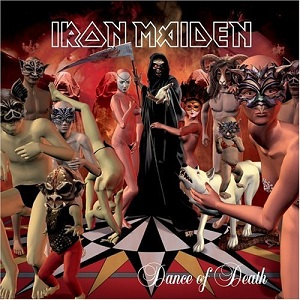
i think the worst thing to ever happen to visual art was whatever this like overly rounded painting style is. it makes me think of Tim Burton and steampunk and all sorts of just really blah things. most people here might think this shockingly graphic example i won't embed in my post here is bad, too, but i kinda like it as an extension of the music.[/url]
i've always really liked the Paid in Full cover, personally. i'm also very partial to the grandiose, ridiculous album cover style that that Snoop Dogg album has that you see a lot in various circles, though i've never seen that one in particular.
I think if the 'Paid In Full' in red wasn't pasted crooked on the cover (almost randomly it seems, as you can barely read it), then maybe I'd like it.. I just think its way too corny. Money and chains.. Very artistic.
As for the snoop album I understand what you mean about these 'grandiose' styled covers, but I've honestly always hated them. That one in particular.. The font they chose for the bottom strip is barely legible. I get that they want them to be flashy looking but this is just stupid looking if you ask me.
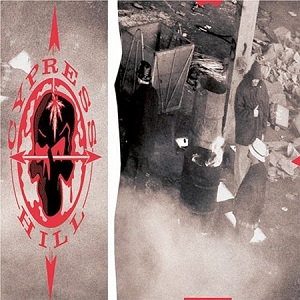
The only one I kind of understand is this one here..
You cannot post new topics in this forum You cannot reply to topics in this forum You cannot edit your posts in this forum You cannot delete your posts in this forum You cannot vote in polls in this forum
 Revolution909


 Lachapelle




 baystateoftheart

 pa


 AAL2014