This looks pretty neat, you should probably contact AM if you’re willing to do some web design for the site. _________________ Overall chart Fake overall chart
I think that "BEA is great for those who are here and have been here...but I think that "Best Ever Albums" should be a part of whatever the logo is. If I saw your logo and had never been here...I would have no idea what the this place was about, and I would have no idea what "BEA" could mean. The full name is important to the concept of the site... _________________ I'm leaning on the threshold
Of her mystery
And crashing through the walls
Of dying history
baystateoftheartNeil Young as a butternut squashProfile Massachusetts
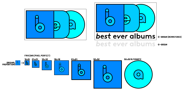
Good work! That represents a sleeve, an insert, and a record, right? If so, I would recommend the letters to be adjusted so that the "a" is centered in the record, and also more recognizable like meccalecca said. To Romanelli's point, I don't think the logo itself has to have the whole title, as long as it's prominently featured elsewhere in the site header like on RYM. While that's not in your current mockup, it could definitely be added. With some tweaks, this could absolutely be an upgrade for the top left logo and the favicon. _________________ Join us in the canon game :) / Add me on RYM
I made a board with some little fixes and a version with the title. I made a favicon with the “b”, but was wondering if it wasn't better to use the “a“ for albums,
The Inkscape SVG file is downloadable at this adress.
And, moreover, I think that using the “a” is more original and inspiring than a “b” with a shape that have been seen in Beats logo, now Beatport, Boulanger (I'm French) etc.
You cannot post new topics in this forum You cannot reply to topics in this forum You cannot edit your posts in this forum You cannot delete your posts in this forum You cannot vote in polls in this forum
 BarryCap


 meccalecca

 LedZep
")
 Romanelli
 baystateoftheart