|
View previous topic :: View next topic
|
|
| Author |
Message |
BarryCap

Gender: Male
Location: Poitiers

|
- #1
- Posted: 06/21/2021 09:42
- Post subject: Best Ever Albums theme
|
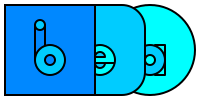
I was roaming around on BEA, I made a logo and I changed a bit of CSS to see what it would look like with another design. What do you think?

Thumbnail. Click to enlarge.
|
|
|
|
|
Back to top
|
|
|
|
meccalecca
Voice of Reason

Gender: Male
Location: The Land of Enchantment

|
- #2
- Posted: 06/21/2021 14:27
- Post subject: Re: Best Ever Albums theme
|
| BarryCap wrote: | I was roaming around on BEA, I made a logo and I changed a bit of CSS to see what it would look like with another design. What do you think?
|
I dig the logo concept, though the 'a' looks like an 'o'.
The site could use a bit of a design refresh, but I understand how much work that can be.
_________________
http://jonnyleather.com
|
|
|
|
|
Back to top
|
|
LedZep

")
|
|
|
Back to top
|
|
Romanelli
Bone Swah

Gender: Male
Location: Broomfield, Colorado
Moderator
|
- #4
- Posted: 06/21/2021 16:37
- Post subject:
|
I think that "BEA is great for those who are here and have been here...but I think that "Best Ever Albums" should be a part of whatever the logo is. If I saw your logo and had never been here...I would have no idea what the this place was about, and I would have no idea what "BEA" could mean. The full name is important to the concept of the site...
_________________
May we all get to heaven
'Fore the devil knows we're dead...
|
|
|
|
|
Back to top
|
|
baystateoftheart
Neil Young as a butternut squash

Age: 29
Location: Massachusetts
|
- #5
- Posted: 06/21/2021 21:25
- Post subject:
|
Good work! That represents a sleeve, an insert, and a record, right? If so, I would recommend the letters to be adjusted so that the "a" is centered in the record, and also more recognizable like meccalecca said. To Romanelli's point, I don't think the logo itself has to have the whole title, as long as it's prominently featured elsewhere in the site header like on RYM. While that's not in your current mockup, it could definitely be added. With some tweaks, this could absolutely be an upgrade for the top left logo and the favicon.
_________________
Add me on RYM
|
|
|
|
|
Back to top
|
|
|
|
BarryCap
Gender: Male
Location: Poitiers
|
- #6
- Posted: 06/22/2021 17:57
- Post subject:
|
I made a board with some little fixes and a version with the title. I made a favicon with the “b”, but was wondering if it wasn't better to use the “a“ for albums,
The Inkscape SVG file is downloadable at this adress.
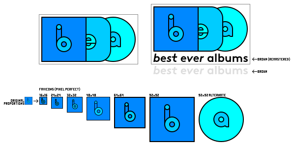
Thumbnail. Click to enlarge. |
|
|
|
|
Back to top
|
|
BarryCap
Gender: Male
Location: Poitiers
|
- #7
- Posted: 06/22/2021 18:07
- Post subject:
|
|
And, moreover, I think that using the “a” is more original and inspiring than a “b” with a shape that have been seen in Beats logo, now Beatport, Boulanger (I'm French) etc.
|
|
|
|
|
Back to top
|
|
|