|
View previous topic :: View next topic
|
|
| Author |
Message |
II
workd my but just to not know what to name my rank
Age: 100
Location: Questionmarkland. You ask: "Where is that land?" There is no answer. Only a ? 
- #11
- Posted: 05/11/2025 15:23
- Post subject:
|

Thumbnail. Click to enlarge.
Another Sunny Day - Honeydip
Effectively using a 180 degree image-spin and a fish-eye lens to create an illusion of the band members' shadows stemming from the cloudy sunset atmosphere of planet Earth (or just a planet in general), while in reality the image depicts them standing on the beach. The sunset creates really lovely colors in the whole scenery.
The image fits the sonic scapes of the release's music, which is some great-sounding shoegaze.
II listened to this album three times in a row yesterday (and II didn't listen to this album beforehand! Except finishing only the first two tracks back in an earlier attempt, only wanting to save more energy for it later on since most tracks are quite long), which has never happened to me before!
| LTSings wrote: | I like the colors on this cover and there's just something quaint about it, which is the kind of covers I like.

Thumbnail. Click to enlarge.
Take Heart by Shannon Adducci[/img] |
The images has a nice color scheme, mainly composed of red and yellow (which catch the eye the quickest since the red door takes a lot of space in the image, and the yellow coat and her hair), and also dark brown, black, orange and the "cooler" colors: green of the plants and azure of the sky are reflected on the door's glass windows, which concludes the image priortizing the warmer colors, for they give a cozy feeling. And the texts on the lower corner adapt to the image's color scheme, which is effective.
Last edited by II on 05/11/2025 15:41; edited 1 time in total
|
|
|
|
|
|
- #12
- Posted: 05/11/2025 15:41
- Post subject:
|
| II wrote: | | LTSings wrote: | I like the colors on this cover and there's just something quaint about it, which is the kind of covers I like.
Thumbnail. Click to enlarge.
Take Heart by Shannon Adducci[/img] |
The images has a nice color scheme, mainly composed of red and yellow (which catch the eye the quickest since the red door takes a lot of space in the image, and the yellow coat and her hair), and also dark brown, black, orange and the "cooler" colors: green of the plants and azure of the sky are reflected on the door's glass windows, which concludes the image priortizing the warmer colors, for they give a cozy feeling. And the texts on the lower corner adapt to the image's color scheme, which is effective. |
Thanks. Many people might not like simple, quaint album covers like this, but for me it's a good one. I don't usually go for something too outlandish or elaborate, but that might be some people's thing.
|
|
|
|
II
workd my but just to not know what to name my rank
Age: 100
Location: Questionmarkland. You ask: "Where is that land?" There is no answer. Only a ?
- #13
- Posted: 05/11/2025 15:44
- Post subject:
|
| LTSings wrote: | | II wrote: | | LTSings wrote: | I like the colors on this cover and there's just something quaint about it, which is the kind of covers I like.
Thumbnail. Click to enlarge.
Take Heart by Shannon Adducci[/img] |
The images has a nice color scheme, mainly composed of red and yellow (which catch the eye the quickest since the red door takes a lot of space in the image, and the yellow coat and her hair), and also dark brown, black, orange and the "cooler" colors: green of the plants and azure of the sky are reflected on the door's glass windows, which concludes the image priortizing the warmer colors, for they give a cozy feeling. And the texts on the lower corner adapt to the image's color scheme, which is effective. |
Thanks. Many people might not like simple, quaint album covers like this, but for me it's a good one. I don't usually go for something too outlandish or elaborate, but that might be some people's thing. |
You're welcome 😄
The colors including the scenery give a cozy feeling, so that feels always welcoming visually.
This one does the same too:
| LTSings wrote: | Here's one I like. I like the vintage mail and stamps.
|
|
|
|
|
II
workd my but just to not know what to name my rank
Age: 100
Location: Questionmarkland. You ask: "Where is that land?" There is no answer. Only a ?
- #14
- Posted: 05/11/2025 16:05
- Post subject:
|
| craola wrote: | 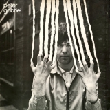 |

Thumbnail. Click to enlarge.
Peter Gabriel II - Peter Gabriel
This one is seriously eye-catching! (And also paperboard-scratching) And is conceptually simple yet uniquely creative!
Could be one of the best II've seen.
|
|
|
|
II
workd my but just to not know what to name my rank
Age: 100
Location: Questionmarkland. You ask: "Where is that land?" There is no answer. Only a ?
|
|
|
- #16
- Posted: 11/03/2025 17:44
- Post subject:
|

Thumbnail. Click to enlarge.
Thumbnail. Click to enlarge.
Thumbnail. Click to enlarge. |
|
|
|
Johnnyo
Gender: Male
Age: 66
Location: London Town 
- #17
- Posted: 11/04/2025 09:01
- Post subject:
|
I'm not sure that I get the concept of "good" albums covers. Not sure what that means but if you are talking about great album covers in terms of art or creativity you have to start with this
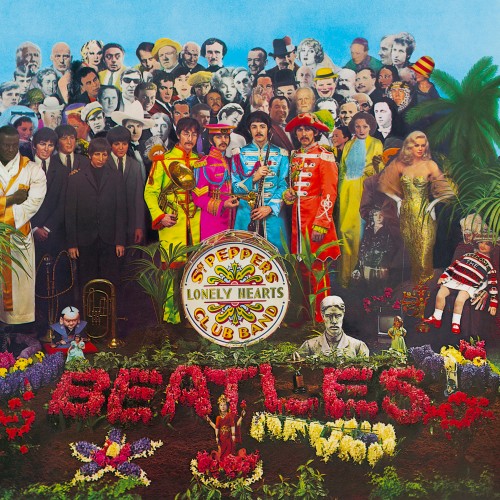
Sgt. Pepper's Lonely Hearts Club Band (1967) by The Beatles 
An original concept (at the time but done to death since) brilliantly executed. That's an obvious one. Going to go away and think of some others to post
|
|
|
|
Romanelli
Bone Swah
Gender: Male
Location: Broomfield, Colorado 
Moderator
- #18
- Posted: 11/04/2025 13:34
- Post subject:
|
| Johnnyo wrote: | I'm not sure that I get the concept of "good" albums covers. Not sure what that means but if you are talking about great album covers in terms of art or creativity you have to start with this
Sgt. Pepper's Lonely Hearts Club Band (1967) by The Beatles
An original concept (at the time but done to death since) brilliantly executed. That's an obvious one. Going to go away and think of some others to post |
I think it's pretty much the same IDEA as the concept of great albums. Everyone sees it differently, and has their own list.
To me, an album cover has the chance to be a gateway into an album. When you buy an album, what do you experience before anything else? It's that front cover picture. The artist has a single chance to make the album's first impression visually. I like covers that seem to embrace that idea, and that add to the artistic value of the album. To me, a picture of the artist just standing there in an obviously posed photo in front of a wall or a building is mostly bottom rail creativity, and a wasted opportunity. I like covers that take the chance to add an artistic visual to the album...not just a picture.
There are exceptions for me where an artist photo works well. Alice Cooper's Love It To Death is one. New York Dolls. One of my favorites is this one:
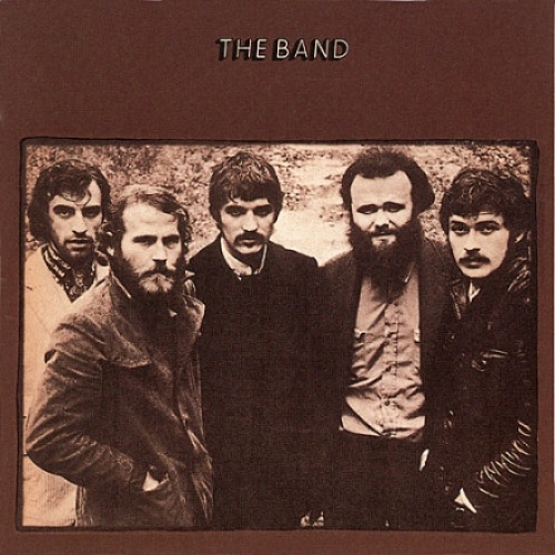
The Band (1969) by The Band 
This photo was taken in a cold rainstorm. They were wet, cold and very uncomfortable. Nobody is trying to look like a rock star. Capturing them in that way, using black and white, created a unique look. The background doesn't matter, and in fact barely exists. What's important is the seriousness that was captured in them. They are close at this time, and for this shot, they are very huddled together. You can't tell from looking at it what time these men are from. Was this photo taken in the 1960's? The 1930's? Before that? It's a picture that works because the essence of the band was successfully captured in the shot. These guys actually sound like this picture. The placement of this photo on a plain brown background with simply The Band at the top caps it off. This cover appears very simple, and it is...but it's also a cover that really successfully introduces you to what's inside the packaging, which I think is rare.
_________________
I'm leaning on the threshold
Of her mystery
And crashing through the walls
Of dying history
|
|
|
|
Johnnyo
Gender: Male
Age: 66
Location: London Town
- #19
- Posted: 11/04/2025 20:15
- Post subject:
|
There are a lot of album covers that, for various reasons, I like, but truly great album covers, mmmmmmmm?
If we are talking about a cover that somes up an album with just one photo, this is one for me
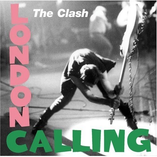
London Calling (1979) by The Clash
Paul Simonon beating the hell out of his guitar. It just felt so right for the album.
the less than subtle reference to the cover of elvis’s self titled album
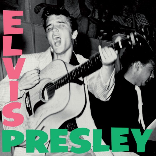
Elvis Presley (1956) by Elvis Presley 
Done deliberately obviously
Both great album covers.
|
|
|
|
Johnnyo
Gender: Male
Age: 66
Location: London Town
- #20
- Posted: 11/04/2025 20:25
- Post subject:
|
| Romanelli wrote: | | Johnnyo wrote: | I'm not sure that I get the concept of "good" albums covers. Not sure what that means but if you are talking about great album covers in terms of art or creativity you have to start with this
Sgt. Pepper's Lonely Hearts Club Band (1967) by The Beatles
An original concept (at the time but done to death since) brilliantly executed. That's an obvious one. Going to go away and think of some others to post |
I think it's pretty much the same IDEA as the concept of great albums. Everyone sees it differently, and has their own list.
To me, an album cover has the chance to be a gateway into an album. When you buy an album, what do you experience before anything else? It's that front cover picture. The artist has a single chance to make the album's first impression visually. I like covers that seem to embrace that idea, and that add to the artistic value of the album. To me, a picture of the artist just standing there in an obviously posed photo in front of a wall or a building is mostly bottom rail creativity, and a wasted opportunity. I like covers that take the chance to add an artistic visual to the album...not just a picture.
There are exceptions for me where an artist photo works well. Alice Cooper's Love It To Death is one. New York Dolls. One of my favorites is this one:
The Band (1969) by The Band
This photo was taken in a cold rainstorm. They were wet, cold and very uncomfortable. Nobody is trying to look like a rock star. Capturing them in that way, using black and white, created a unique look. The background doesn't matter, and in fact barely exists. What's important is the seriousness that was captured in them. They are close at this time, and for this shot, they are very huddled together. You can't tell from looking at it what time these men are from. Was this photo taken in the 1960's? The 1930's? Before that? It's a picture that works because the essence of the band was successfully captured in the shot. These guys actually sound like this picture. The placement of this photo on a plain brown background with simply The Band at the top caps it off. This cover appears very simple, and it is...but it's also a cover that really successfully introduces you to what's inside the packaging, which I think is rare. |
I’m also not a fan of bands on the cover of their albums. A bit lazy IMO.
Hadn’t really considered the self titled band album. I don’t think that it’s a great album cover but does have more to it than most of that ilk.
Gonna have to think about a great cover employing those sorts of images. Might take me a while
|
|
|
|
|
|
|
|
You cannot post new topics in this forum
You cannot reply to topics in this forum
You cannot edit your posts in this forum
You cannot delete your posts in this forum
You cannot vote in polls in this forum
|
|
|